Going through additional examples of things I’d like to see / demonstrate but do not fit into the narrative of the manuscript. Writing these in knitr/dynamic documentation to confirm code produces the examples listed, and give a bit tighter integration between text and code examples.
Show the parameter distributions:
We can also look at the bootstraps of the parameters. Another helper function will reformat this data from reps list. The fit column uses a two-letter code to indicate first what model was used to simulate the data, and then what model was fit to the data. For instance, AB means the data was simulated from model A (the null, OU model) but fit to B.
pars <- parameter_bootstraps(reps)
head(pars)
    value parameter fit rep
 1   1.380        Ro  AA   1
 2 583.109     theta  AA   1
 3 147.015     sigma  AA   1
 4   1.631        Ro  AB   1
 5 602.484     theta  AB   1
 6 130.060     sigma  AB   1
There are lots of options for visualizing this relatively high-dimensional data, which we can easily explore with a few commands from the ggplot2 package. For instance, we can look at average and range of parameters estimated in the bootstraps of each model:
require(Hmisc)
ggplot(subset(pars, fit %in% c("AA", "BB")), aes(fit,
    value)) + stat_summary(fun.y = mean, geom = "bar", position = "dodge") +
    stat_summary(fun.data = median_hilow, geom = "pointrange",
        position = position_dodge(width = 0.9), conf.int = 0.95) +
    facet_wrap(~parameter, scales = "free_y")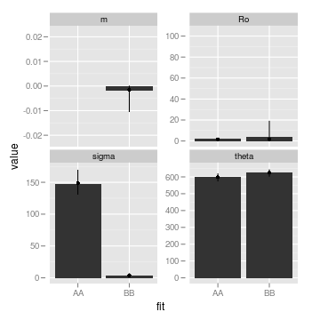
Further tests and examples
Compare likelihood & summary statistic results simulating under the non-linear process vs under the LSN model: see validating approximation
Show ROC curves do improve for each set of statistics as data sampling improves. Current examples make it look like autocorrelation never works. See Getting signal from autocorrelation
Show visually increasing patterns in summary stats from stable systems and non-increasing patterns from unstable ones. See squiggles. Compare to the \(\alpha=r_t^2\) plot.
full replicate code
Into the murky reality – show the windowed auto-correlation, variance, and $ =r(t)^2 $ graphs
Do dependencies in documentation examples need to be listed as package dependencies?