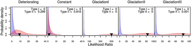
Trying a different set-up for the graphs. Added two additional datasets, trying layout of making all three figures into a panels in a single figure.


Concerns:
- Better than only one empirical example, but not sure that the three Glaciation data sets add that much since they are all quite similar.
- Five panels wide might be too much.
- Don’t have an example where a transition is about to occur but the data doesn’t have adequate power even for our Likelihood method, third panel.
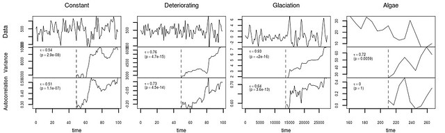
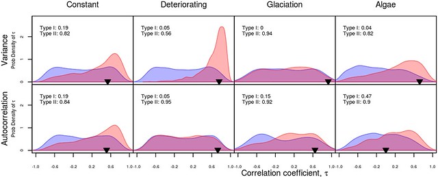
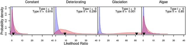
Compare to:
Concerns remaining:
- What order to put the examples?
- The constant case is different in that it is the only one in which the system did not eventually experience a critical transition. Does this need to be emphasized more?
- Does the simulated data need better distinguishing from empirical data?
- The Empirical Glaciation data shown has been interpolated and detrended (following the original author’s study); can this just be mentioned in the captions/appendix?
- Font sizes are a bit troubled, but this can wait?
- Do column names need to be more informative somehow?
- Other concerns?
- Noam suggested showing the crash in the initial data, though this is difficult in the case where the data has been transformed (to repeat treatment it is given in the literature).
- Should I also indicate the N sample points on each figure? text too crowded?
- Should these be presented as panels of a single figure?