Added bar of observed tau on real data to the tau distributions. Fixed the tau-distribution method, running new data and real examples now.
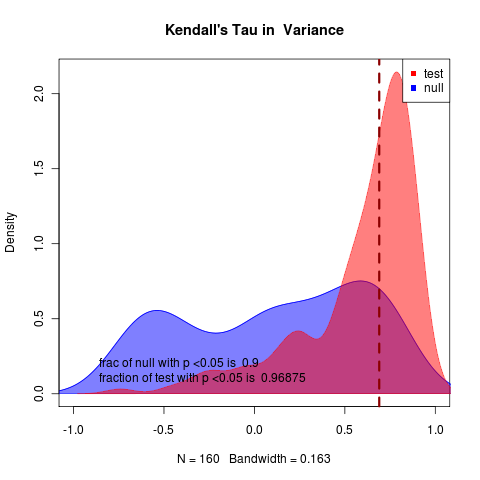
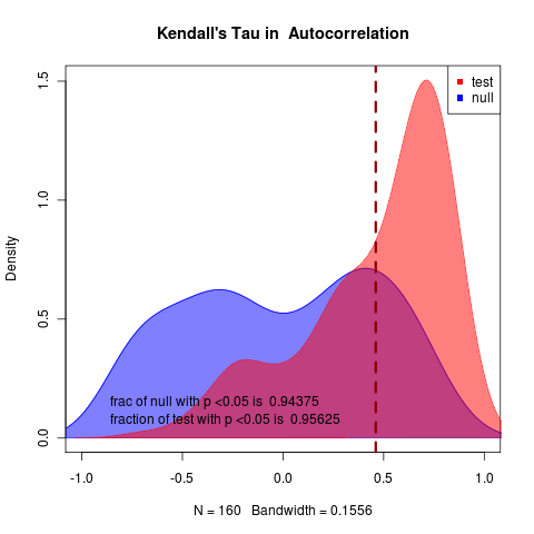
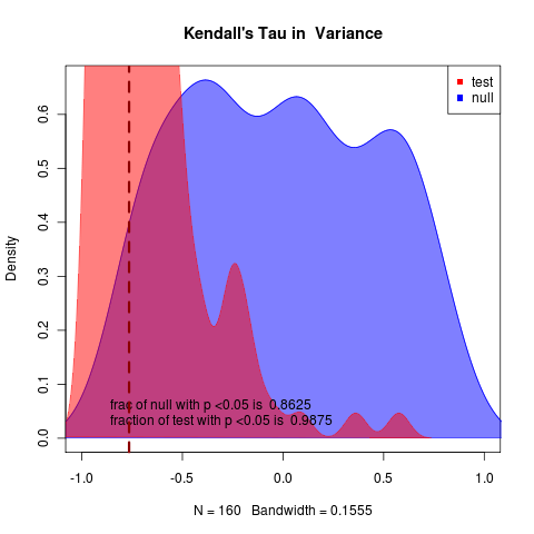
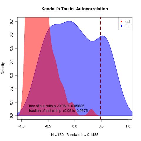
Simulated data: can tell tau apart for instance, for autocorrelation (see photostream for variance, code hash for parameters, etc). 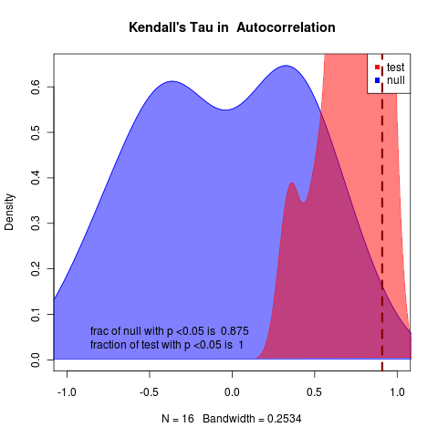
While can’t really tell anything based on the tau on the autocorrelation for the Deuterium data for Glaciation III (which has just about the clearest signal of the deuterium set): 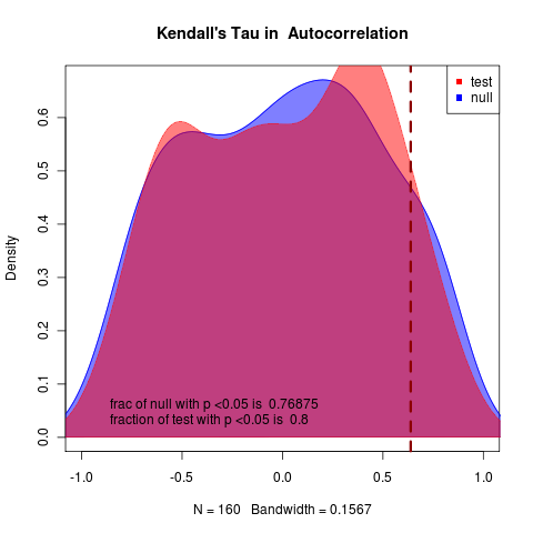
Waiting to see how the likelihood statistics compare on these examples.
Today’s runs: [flickr-gallery mode=“search” tags=“warningsignals” min_upload_date=“2011-03-11 00:00:00” max_upload_date=“2011-03-11 23:59:59”]
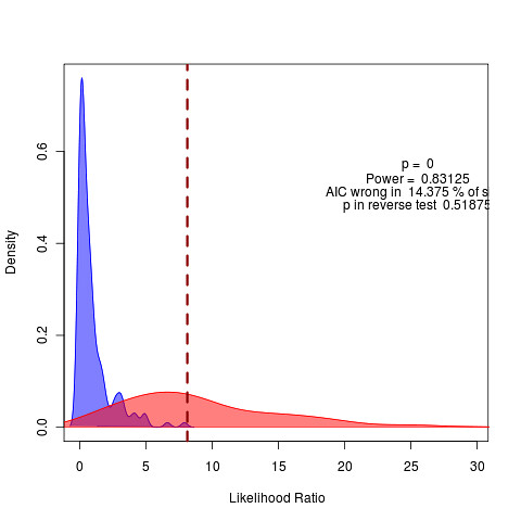
With more replicates, simulated data shows the increased power of the likelihood approach relative to the summary statistics:
Likelihood-based approach for the same data: 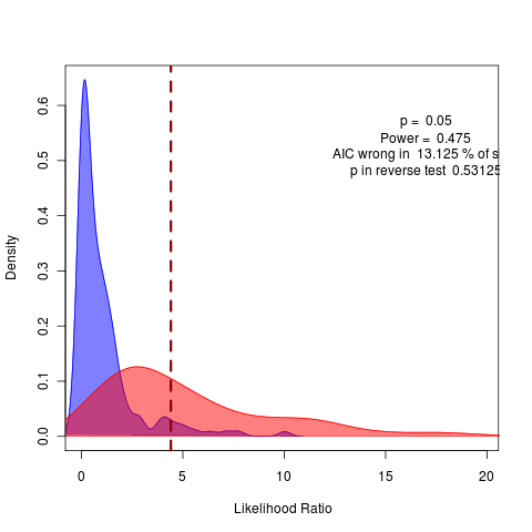
CaCO3 data
The model fit to CaCO3 data actually suggests a stabilizing pattern as the best fit, despite the fact that the estimated autocorrelation is positive. This produces null distributions with largely negative Tau trends in variance (seen in the real data as well) and a negative overall pattern in autocorrelation. The models can be identified by likelihood, though in this case it for a trend of increasing rather than decreasing eigenvalue.
Manuscript working notes
Should make plots for a panel showing how the nonlinear S curve model reduces to a quadratic saddle-node bifurcation picture which reduces to a linear OU model (with moving-average, changing noise and stability, both pictorially and by equations).