Exploring potential plots that would allow for some visualization of the uncertainty in each of the models. Example follows up on analysis of e97043d/allen.md, as also in the script from b5d78b9/step_ahead_plots.md
One-step ahead predictor plots and forecasting plots
Set our usual plotting options for the notebook
opts_chunk$set(tidy = FALSE, warning = FALSE, message = FALSE, cache = FALSE,
    comment = NA, fig.width = 7, fig.height = 4)
library(ggplot2)
opts_knit$set(upload.fun = socialR::flickr.url)
theme_set(theme_bw(base_size = 12))
theme_update(panel.background = element_rect(fill = "transparent", colour = NA),
    plot.background = element_rect(fill = "transparent", colour = NA))
cbPalette <- c("#000000", "#E69F00", "#56B4E9", "#009E73", "#F0E442", "#0072B2",
    "#D55E00", "#CC79A7")
Now we show how each of the fitted models performs on the training data (e.g. plot of the step-ahead predictors). For the GP, we need to predict on the training data first:
gp_f_at_obs <- gp_predict(gp, x, burnin=1e4, thin=300)For the parametric models, prediction is a matter of feeding in each of the observed data points to the fitted parameters, like so
step_ahead <- function(x, f, p){
  h = 0
  x_predict <- sapply(x, f, h, p)
  n <- length(x_predict) - 1
  y <- c(x[1], x_predict[1:n])
  y
}
Which we apply over each of the fitted models, including the GP, organizing the “expected” transition points (given the previous point) into a data frame.
df <- melt(data.frame(time = 1:length(x), stock = x,
                GP = gp_f_at_obs$E_Ef,
                True = step_ahead(x,f,p),
                MLE = step_ahead(x,f,est$p),
                Parametric.Bayes = step_ahead(x, f, bayes_pars),
                Ricker = step_ahead(x,alt$f, ricker_bayes_pars),
                Myers = step_ahead(x, Myer_harvest, myers_bayes_pars)
                 ), id=c("time", "stock"))

ggplot(df) + geom_point(aes(time, stock)) +
  geom_line(aes(time, value, col=variable)) +
scale_colour_manual(values=colorkey) 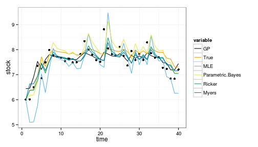
Posterior predictive curves
This shows only the mean predictions. For the Bayesian cases, we can instead loop over the posteriors of the parameters (or samples from the GP posterior) to get the distribution of such curves in each case.
We will need a vector version (pmin in place of min) of this function that can operate on the posteriors, others are vectorized already.
ricker_f <- function(x,h,p){
  sapply(x, function(x){
    x <- pmax(0, x-h)
    pmax(0, x * exp(p[2] * (1 - x / p[1] )) )
  })
}
Then we proceed as before, now looping over 100 random samples from the posterior for each Bayesian estimate. We write this as a function for easy reuse.
require(MASS)

step_ahead_posteriors <- function(x){
gp_f_at_obs <- gp_predict(gp, x, burnin=1e4, thin=300)
df_post <- melt(lapply(sample(100),
  function(i){
    data.frame(time = 1:length(x), stock = x,
                GP = mvrnorm(1, gp_f_at_obs$Ef_posterior[,i], gp_f_at_obs$Cf_posterior[[i]]),
                True = step_ahead(x,f,p),
                MLE = step_ahead(x,f,est$p),
                Parametric.Bayes = step_ahead(x, allen_f, pardist[i,]),
                Ricker = step_ahead(x, ricker_f, ricker_pardist[i,]),
                Myers = step_ahead(x, myers_f, myers_pardist[i,]))
  }), id=c("time", "stock"))

}


df_post <- step_ahead_posteriors(x)
ggplot(df_post) + geom_point(aes(time, stock)) +
  geom_line(aes(time, value, col=variable, group=interaction(L1,variable)), alpha=.1) +
  facet_wrap(~variable) +
scale_colour_manual(values=colorkey, guide = guide_legend(override.aes = list(alpha = 1))) 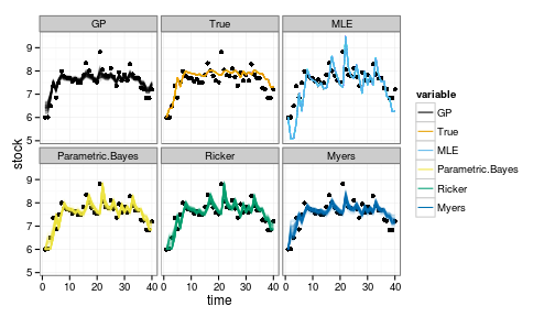
alternately, try the plot without facets
ggplot(df_post) + geom_point(aes(time, stock)) +
  geom_line(aes(time, value, col=variable, group=interaction(L1,variable)), alpha=.1) +
scale_colour_manual(values=colorkey, guide = guide_legend(override.aes = list(alpha = 1))) 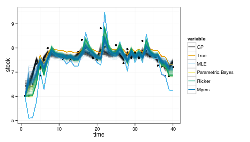
Performance on data outside of observations
Of course it is hardly suprising that all models do reasonably well on the data on which they were trained. A crux of the problem is the model performance on data outside the observed range. (Though we might also wish to repeat the above plot on data in the observed range but a different sequence from the observed data).
First we generate some data from the underlying model coming from below the tipping point:
Tobs <- 8
y <- numeric(Tobs)
y[1] = 4.5
for(t in 1:(Tobs-1))
    y[t+1] = z_g() * f(y[t], h=0, p=p)
Proceed as before on this data:
crash_data <- step_ahead_posteriors(y)

ggplot(crash_data) + geom_point(aes(time, stock)) +
  geom_line(aes(time, value, col=variable, group=interaction(L1,variable)), alpha=.1) +
  facet_wrap(~variable) +
scale_colour_manual(values=colorkey, guide = guide_legend(override.aes = list(alpha = 1))) 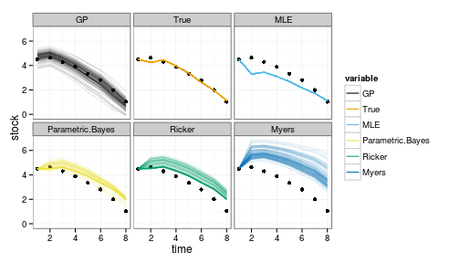
Note that the GP is doing remarkably well even outside the observed range, though with greater uncertainty as well. Other models tend to be overly optimistic, often predicting an increase instead of a decline, hence the many trajectories that continually float above the data.
Forecast Distributions
Another way to visualize this is to look directly at the distribution predicted under each model, one step and several steps into the future (say, at a fixed harvest level). Here we have a simple function that will look one step ahead of the given x (given as index i), then Tobs steps ahead, then 2*Tobs steps ahead, each at a fixed harvest. This lets us compare both the expected outcome over short and long term under a given harvest policy, as well as seeing how the distribution of possible outcomes evolves.
library(expm)
get_forecasts <- function(i, Tobs, h_i){

df <- data.frame(
  x = x_grid,
  GP = matrices_gp[[h_i]][i,],
  True = matrices_true[[h_i]][i,],
  MLE = matrices_estimated[[h_i]][i,],
  Parametric.Bayes = matrices_par_bayes[[h_i]][i,],
  Ricker = matrices_alt[[h_i]][i,],
  Myers = matrices_myers[[h_i]][i,])

df2 <- data.frame(
  x = x_grid,
  GP = (matrices_gp[[h_i]] %^% Tobs)[i,],
  True = (matrices_true[[h_i]] %^% Tobs)[i,],
  MLE = (matrices_estimated[[h_i]] %^% Tobs)[i,],
  Parametric.Bayes = (matrices_par_bayes[[h_i]] %^% Tobs)[i,],
  Ricker = (matrices_alt[[h_i]] %^% Tobs)[i,],
  Myers = (matrices_myers[[h_i]] %^% Tobs)[i,])

T2 <- 2 * Tobs

df4 <- data.frame(
  x = x_grid,
  GP = (matrices_gp[[h_i]] %^% T2)[i,],
  True = (matrices_true[[h_i]] %^% T2)[i,],
  MLE = (matrices_estimated[[h_i]] %^% T2)[i,],
  Parametric.Bayes = (matrices_par_bayes[[h_i]] %^% T2)[i,],
  Ricker = (matrices_alt[[h_i]] %^% T2)[i,],
  Myers = (matrices_myers[[h_i]] %^% T2)[i,])

forecasts <- melt(list(T_start = df, T_mid = df2, T_end = df4), id="x")

}

i = 15
This takes i, an index to x_grid value (e.g. for i=15 corresponds to a starting postion x = 3.4286)
forecasts <- get_forecasts(i = 15, Tobs = 5, h_i = 1)

ggplot(forecasts) +
  geom_line(aes(x, value, group=interaction(variable, L1), col=variable, lty=L1)) +
  facet_wrap(~ variable, scale="free_y", ncol=2) +
scale_colour_manual(values=colorkey) 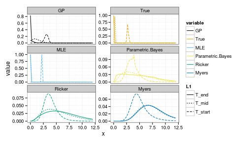
We can compare to a better starting stock,
i<-30where i=30 corresponds to a starting postion x = 7.102
forecasts <- get_forecasts(i = i, Tobs = 5, h_i = 1)

ggplot(forecasts) +
  geom_line(aes(x, value, group=interaction(variable, L1), col=variable, lty=L1)) +
  facet_wrap(~ variable, scale="free_y", ncol=2) +
scale_colour_manual(values=colorkey) 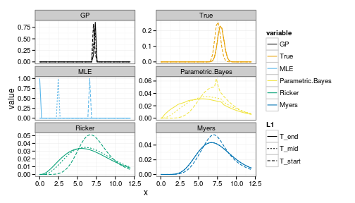
Note the greater uncertainty in both the positive and negative outcomes under the parametric Bayesian models (of correct and incorrect structure).
Misc reading
Apparently I am catching up on my C. Titus Brown reading… Achiving comments for my records & to keep them in my local search index.
Titus Brown on if he really practices Open Science?
Methinks:
I think you undersell your Github practices regarding Open Science. While I agree entirely that anyone reading through your source-code to scoop you is incredibly unlikely; I imagine many researchers would still fear the practice of using a public, Google-indexed repository, particularly if they also practice reasonable literate programming documentation, provide test cases, and use issue tracking that could allow some close rival to scoop them.
It sounds like you are talking more about not marketing your work before it is “finished”, rather not being open. (When you say “to really open up about what we’re doing” I assume you mean advertising the results, rather than something like simply putting your notebook or publication drafts on github). Though “Open Science” is used in in both contexts, marketing your pre-publication science takes additional time that exposing your workflow on Github does not. The latter practice provides transparency, provenance machine-discoverability, (and cool graphs of research contributions like https://github.com/ctb/khmer/c… etc. Perhaps you are too hard on yourself here.
Meanwhile, I think suggesting that being open prematurely would “waste other people’s time, energy, and attention” is misleading and damaging here. Sure, I understand you mean that marketing unfinished results (blog, tweet, present at conferences) would do these things, but when the same reason is frequently given for not sharing data, code, etc this becomes very damaging. Some people may find it useful to blog/tweet/present unfinished work (with appropriate disclaimer) to get feedback, build audience, or for all the same reasons one would do so with published work, but to me that is really just a question of timing & marketing, not a question of “openness”.
On the Costs of Open Science, which I refute:
Great post and important question. I certainly agree that it is all about incentives, but I think an important missing part of that discussion is in the timescales. Certainly there is a cost to not writing up the low-lying fruit following up on your work, but surely such exercises would take non-trivial time away from doing whatever (presumably more interesting) stuff you did instead. Perhaps the it is the benefits, not the costs, that are hidden:
It sounds like you may have forgone a short-term cost in not publishing these easy follow-ups while gaining a benefit both of time to work on other interesting things and of getting other researchers invested in your work, who might not have taken it up at all if there was no low-hanging fruit to entice them in. Once invested in it, no doubt they can continue to be a multiplier of impact. Meanwhile you break new ground rather than appearing to continue to wring every ounce from one good idea, right? (If I read this correctly, both you and George Gey appear to regard these other publications as not particularly exciting work; the regret comes only because they are intrinsically valued publications)
It sounds like the difficulty with these benefits is that they pay off only on a longer timescale than the gristmill publication strategy. On the longest timescales, e.g. career lifetime, it seems clear that at least in a statistical sense, researchers who keep breaking new ground while allowing others to pick the low-hanging follow-up work will be much more likely to end up as the most distinguished researchers, etc. When the relevant timescale is a tenure clock rather than a career, the perhaps the calculus is different?
Without open science, moving on to other exciting stuff is far less effective, since it leaves both unfinished work and less impact. Perhaps this a somewhat idealized view, and perhaps the timescales for tenure etc work against this strategy. You and others could no doubt better speak to whether the candidate who says “look at all the papers I wrote about X” or the one who says “look at all the papers others have built upon my method X while I break ground in hard problem Y” has the stronger case.
Partial implementation of R to Latex equation converter from @hadleywickam.
Ah ha! Documenting equations in ROxygen. Guess one day I (or devtools) will move to Roxygen3.