Exploring the best way for representing the Monte Carlo Likelihood approach visually, including comparison power and comparison to AIC.
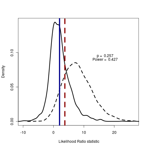
Blue line is AIC, dotted red line is real data. Red line to the right of blue line indicates test model is rejecting the null model by AIC score. Solid distribution are likelihood ratios simulated under null, dotted are simulated under test.
The p-value is the integral of the null distribution lying right of the observed likelihood ratio in the real data:
plot(pow, main="", legend=FALSE, type="density", test_dist=F, shade_power=F, shade_p=T, show_aic=FALSE, show_data=T)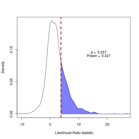
As the dotted red line (real data) falls to the right of the solid blue line of difference in AIC penalties, the AIC score prefers the test model. The fraction of the null distribution falling to the right of the AIC line indicates how often the AIC score will be wrong when comparing these two models.
plot(pow, main="", legend=FALSE, type="density", test_dist=F, shade_power=F, shade_p=F, show_aic=T, show_data=T, shade=F, shade_aic=T)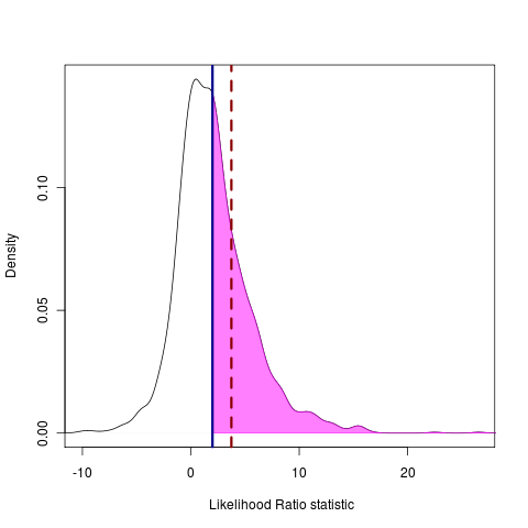
The power to distinguish between models is represented as the area under the test curve that falls to the right of a point that is in the (say) 5% tail of the null distribution, indicated by the shading:
plot(pow, main="", legend=FALSE, type="density", test_dist=T, shade_power=T, shade_p=F, show_aic=FALSE, show_data=F)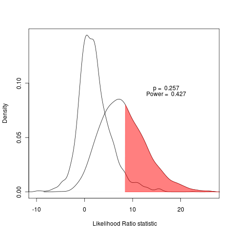
(Reproduce figures by setting code to match this commit.)
Reading Seminar
Rannala Monte Carlo today, discussing: Ané, C. et al. Bayesian estimation of concordance among gene trees. Molecular biology and evolution 24, 412-26(2007). https://www.ncbi.nlm.nih.gov/pubmed/17095535
Estimate concordance in gene trees by organizing under Dirchlet process. Interesting more flexible but less mechanistic interpretation than the species tree coalescent approaches we’ve been reading. Started off with a great tangential discussion on yesterday’s seminar.